
Event Nomination Tool
Creating a new tool to aid in nominating and approving attendees for large marketing events.

Due to privacy restrictions, some copy has been changed and the logos have been blurred. The two large events will be referred to as “Event 1” and “Event 2” to replace the actual event names.
Project overview
At Firewood, I was brought on to help design an event nomination desktop app for a large company to help their employees nominate their clients to attend large marketing and sales events. This desktop app would be replacing the use of spreadsheets, which have proven to be very frustrating, time-consuming, and error-prone. In the past, the spreadsheets have constantly crashed and pose a data risk.
Tools:
Adobe XD
Jira
Team:
UX/UI Designer (me)
Technical project manager
2 Developers
QA manager
Copywriter
Duration:
6 months
Methods:
User interviews
User testing
Stakeholder meetings
Journey mapping
Wireframing
Prototyping
QA using Jira
My role
Collaborating cross-functionally with the project manager, developers, copywriter and QA analyst, I helped build a robust desktop enterprise application. To understand our users, we started with a deep dive into the personas and user journey. From there, I designed multiple rounds of wireframes, iterating on feedback from user testing and stakeholders. I led weekly meetings with the stakeholders to walk them through my design decisions and prototypes. Once wireframes were approved, I worked with a copywriter to match brand voice. Finally, I participated in QA and worked with the developers for the final handoff.
Terminology
Here is an outline of some of the terminology I will be using throughout the case study:
Nominator = someone who chooses clients to invite/nominate to large events
Nominee = someone who is invited (nominated) to an event
Attendee = someone who has been approved to attend an event
Sub-events = smaller events under the umbrella of the larger events. These events are often restricted to a certain type of attendee
My design approach

Discovery
Understanding the users, the problem, and the proposed solution
I was brought in after the project had already been kicked off and scoped, so my first step was to familiarize myself with the users, the problem, and the proposed solution before jumping into design.
The users
There are three different users that each have their own section within the tool. For the purposes of this case study, I decided to focus on the primary user, which is the nominator. The other users of this tool are the event owner who sets objectives and criteria for the events, and the approver who approves or rejects nominations that the nominator makes.

The problem
Prior to this tool being built, large spreadsheets were used by nominators to nominate clients for large events. These spreadsheets posed many issues for the nominators. They were extremely frustrating to use, repetitive, and would often freeze or break due to thousands of lines of data. They posed a data risk and were not ideal for data storage.
Additionally, they couldn’t track well how other teams were doing or see how many seats were still missing. Nominators also wanted to make sure that had equal representation between different employee/company types but didn’t know how to see who was already nominated or attending.

The solution
A web-based application to allow for organized data storage, easy nominating, event editing, and approving for large events. The solution we created allows nominators to easily nominate their clients, see how they are doing compared with their team and the event as a whole, and have visibility into who has already been nominated.

User flows
Once I had a better understanding of the users, the problem, and the proposed solution, I led a user flow session with the team. This helped me understand the different paths the user could take within the tool, which would help me complete the next iteration more effectively.
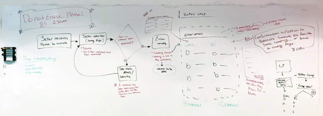

First iteration
Downsizing from seven events to two events
The initial wireframes that had been created were created for seven events. We received feedback from stakeholder that the tool would actually only support two events at this time, so my first task was to downsize the wireframes to make it work for two events.
When I spoke with the stakeholders, they pointed out that the same client could be nominated for both events. I chose to provide nominators with the ability to nominate one person for two events simultaneously. This would make the nomination process quicker since they wouldn’t have to nominate the same person twice for different events. In order to nominate someone for an event, they need to select the company, and enter the client’s email.
Please see the clickable prototype here.

Feedback from stakeholders
I presented this iteration to stakeholders and received feedback that differences between Event 1 and Event 2 do not allow for simultaneous nominations.
Event 1:
There are a certain number of spots allocated to each company
New companies can be requested if they are not available on the company list
Additional nominees can be requested if a company’s allocated spots are all taken
Organized by company
Some sub-events have a set list of people who are already qualified
Event 2:
No allocated spots - just a certain number allocated to the event
A waitlist becomes available once the event is full
Organized by segement (retail, automotive, finance, etc)
Second iteration
Incorporating stakeholder feedback
For the second round, I adapted the flow for individual nominations per event. I also made some landing page changes to show more relevant data to the sellers. This was the prototype that I used for user testing.
Please see the clickable prototype here.
Nomination process

Landing page
Event details page
Usability testing
Testing the prototype with actual users to iterate based on user needs and feedback
I tested with users by sending them the link and having them share their screen with me. I asked them to narrate their thoughts and process as they clicked through the tasks I gave them.
Tested the existing prototype with 12 nominators
Users were people who would be actually in charge of nominating for an event
Asked users to complete various tasks within the tool:
Nominate someone for Event 1
Swap someone out for Event 1 from Amazon
Request to add an additional nominee to Amazon at Event 1
Request to add a new company.
View user testing synthesis here
Key insights from testing
Nominators want to see more information about sub-events during the nomination process
The nominate button needs more visibility - currently have to scroll to see it on the home screen
The landing page data isn’t necessary especially since there is more detailed data on the event details page.
It would be helpful to see swap/reject history in the nominations table.
“The tool is much more organized, and it’s nice to have everything in one place. There’s more visibility into what’s going on.”
“To be able to check RSVP rate and know exactly who is nominated, who is coming, who is confirmed. To be able to see that in the same tool is extremely helpful.”
“It’s a massive improvement.”
“Anything is better than a spreadsheet.”
Final prototype and wireframes
Iterating on round 2 based on user and stakeholder feedback to come to a final design.
Landing page evolution
Iteration 1
Round 1 of the landing page features event stats at the top of the page with the company list and people attending below. I received feedback that the company list was not necessary on the landing page and that the “nominate” CTA should be more accessible, which led to my round 2 iteration.
Iteration 2
Round 2 of the landing page features more detailed event stats than round 1 as well as some high level information about the event and the “nominate” CTA. I received feedback through user testing that the event stats were not necessary on the landing page and the “nominate” CTA needed to be above the fold.
Final prototype and wireframes
The final iteration of the landing page features high level information about each event with the option to either nominate or see more details. This iteration was well received by stakeholders.
Event details page evolution
Iteration 1
The first round of the event details page featured some event details on the top and the table below with an option to filter and search. I received feedback that there would need to be room for more information including sub-events in the top section. After reviewing with stakeholders, we also determined that there is no need for the search bar.
Iteration 2
The second round of the event details page featured high level stats on the individual, team, and event levels. The details could then be expanded to show event information and sub-event information. The feedback I received on this iteration was that the stats at the top would be different for each different level. There is also no way to easily enter the nomination flow from this page, so a CTA would need to be added.
Final prototype and wireframes

In the final iteration, I worked with a copywriter to match the brand voice. I also refined styles based on brand guidelines. I used Jira to work on QA with the developers and the site has been launched.
Reflections and results
Looking back on what could’ve been improved and what went well.
This project was incredibly challenging and rewarding. I learned how to work with limited time, resources, and budget to arrive at the best possible outcome for the users. If I could go back and change things, here’s what I would have changed:
I would have wanted to be involved in the scoping of the project to ensure enough hours were allocated to UX to go through more of the UX process.
I would have wanted to run an additional round of user testing after the copy had been put in to ensure that the nomination flow and the tool was still easy for the users.
I would have wanted more time to explore other ways of nominating more efficiently.
I would have wanted to start working with developers earlier on in the process to make sure I was designing for cleaner data storage in the back end.